import pyecharts.options as opts
from pyecharts.charts import Line
line = Line()
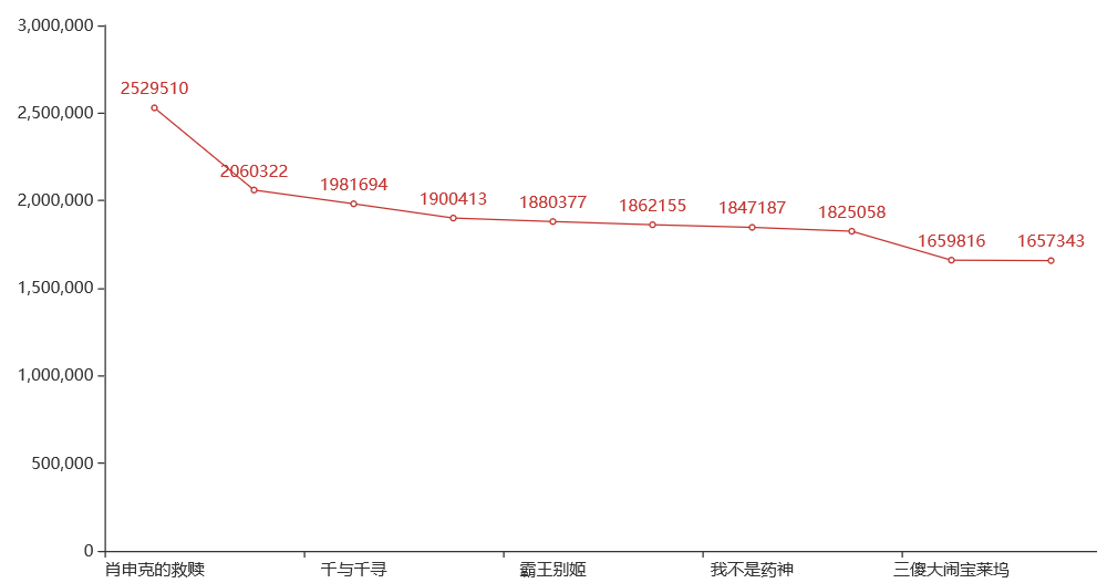
line.set_global_opts(title_opts=opts.TitleOpts(title="豆瓣影评人数top10电影"))
line.add_xaxis(["肖申克的救赎", "这个杀手不太冷", "千与千寻", "阿甘正传", "霸王别姬", "泰坦尼克号", "我不是药神", "盗梦空间", "三傻大闹宝莱坞", "疯狂动物城"]
)
line.add_yaxis("影片评价人数top10", [2529510, 2060322, 1981694, 1900413, 1880377, 1862155, 1847187, 1825058, 1659816, 1657343])
line.set_global_opts(xaxis_opts=opts.AxisOpts(name_rotate=60, axislabel_opts={"rotate": 15}))
line.render("top10折线图.html")


发表评论